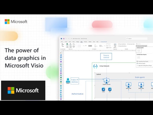
The power of data graphics in Microsoft Visio
Microsoft 365
0:07 Welcome to another Visio Insights presentation.
0:09 Have you ever had the case that you had some data in your Visio diagrams,
0:14 but that was just stored in your Visio shapes in the form of shape data.
0:20 Wouldn't it be nice if you could somehow visualize or interpret
0:24 this data and make your shapes react to data changes?
0:28 Well, this is exactly what data graphics are made for.
0:33 So in this case, in this example, I have a simple Visio shape,
0:38 a computer shape, where I filled in some shape data.
0:42 You see some IP address, some subnet mask, some product description,
0:47 the building, the location, and of course the asset number.
0:50 Now, how do you visualize it?
0:53 Well, one way of course would be to write
0:55 a text below the shape and add the data.
0:58 However, there is a more efficient way.
1:00 In Visio Plan 2, you will see that there is a data tab.
1:06 And on this data tab,
1:07 you will have many options among them is also to show and hide
1:12 the shape data window so this is where you will usually see the metadata.
1:17 But there is also another category which is called advanced data linking.
1:21 And in this case, we just go to Advanced Data Graphics.
1:25 And the data graphic is the trick to do the magic.
1:30 Now we'll go and hit Create New Data Graphic.
1:33 And the first thing the tool will ask me is,
1:37 well, which data would you want to evaluate?
1:40 So we'll hit New Item and then choose a field,
1:43 which could be any of the shape data entries of the corresponding shape.
1:47 So in this case, let's use the IP address.
1:51 So the IP address, I could visualize as a text somewhere next to the shape.
1:57 And there is a huge amount of options like
2:01 font size and whether the value should be shown,
2:04 is it left or right, the label, et cetera, et cetera.
2:07 In this case, I will just use the standard settings and hit OK and hit OK again.
2:14 Then the system will ask me,
2:16 do you want to apply this data graphic to the selected shapes?
2:19 I hit yes and there goes the IP address.
2:22 Now, if you want to move it, you see this little yellow control handle,
2:26 which will allow you to move the shape
2:28 in any sorry the text in any direction you desire.
2:33 Now that's not all because that frankly speaking
2:36 could also be done with a simple label.
2:39 However, keep in mind that the data
2:41 graphic is a package of data evaluation rules.
2:44 So one data graphic could in fact host a bunch
2:48 of different rules on how to visualize certain shape data elements.
2:53 So let's go again to Edit Data Graphic and add a new item.
2:58 So the trick is not to have two data graphics on one shape,
3:02 but to add several items into one data graphic pack.
3:05 And now, we will for example, select the hard drive capacity.
3:12 Now the hard drive capacity, I do not want to visualize just simply as a text.
3:19 I want to have it evaluated.
3:21 So let's use an icon set.
3:24 And, for example, say if the hard drive capacity is smaller
3:29 than so less than or equal to, let's say 10 gigabyte, then show the red icon.
3:37 If it is between, and this is literally one category, between 10 and 100.
3:45 Well, it's not super, but it's okay.
3:48 And if we say well, if it's greater than 101,
3:53 because 100 is in the medium category, please show the green icon.
3:58 There is just one thing to pay attention to, make sure that literally
4:03 there is not two categories or two icons having the same value,
4:06 so that these two should be really distinct.
4:09 And the other thing is make sure you didn't exclude anything.
4:12 So if you say here less than 100 and the other
4:15 one is greater than 100 then you're missing the 100.
4:18 So make sure that every number and even the border values are covered.
4:23 So let's hit OK.
4:25 Let's hit apply.
4:26 Let's hit OK.
4:27 And there you go.
4:29 Here is an additional data graphic.
4:32 We don't, well, I don't like it, especially here in this region.
4:37 So let's go back again to the data graphic.
4:39 Edit the data graphic, go to the Hard Drive Capacity, hit Edit Item.
4:44 And then instead of saying just on the right side,
4:47 let's put it on the Far Right on top of, hit OK,
4:51 hit Apply, hit OK and there goes the symbol.
4:55 There is literally no technical limit on how many
4:59 data graphics you can put on one specific shape.
5:03 Personally, I wouldn't recommend to use like more than five
5:07 or six because you need to explain what the different logos,
5:11 what the different icons, what the different color changes mean.
5:14 Let's do another one, however, which is very, very helpful,
5:18 which means that you could also, for example, evaluate the department.
5:25 Now, how would you evaluate that?
5:26 We won't use another icon.
5:28 We don't want necessarily to have it as a text
5:31 because we don't have so many different departments.
5:33 Now, the data graphics has also a solution for that.
5:36 So let's edit it again.
5:38 Let's add the Department, also, but instead of using an icon set or the text,
5:46 there is Color by Value, which means that the data graphic will
5:51 color the different shapes based on a value.
5:54 Now, for understandable reasons,
5:56 this type of data graphic element only makes sense if
5:59 you have like at max four or five different colors.
6:02 This is just my personal recommendation.
6:04 Technically, there is no limit,
6:05 but I wouldn't do that with like 30 different possible values,
6:08 because it will just get a little bit overcrowded.
6:11 However, you could also have shapes colored in this specific type,
6:15 or you could even have shapes change their color based on a specific value.
6:21 Now, let's go back here and show you that the data
6:25 graphics really also do work in a live, in a living system.
6:29 So let's go ahead and say, okay, we've upgraded this computer to, let's say 250,
6:36 and immediately the data graphic changes its color and, in this case, the icon.
6:42 The same thing would happen if we add the department,
6:45 if let's say Marketing is red and Sales is green,
6:49 the whole shape would also change its color.
6:52 So data graphics are extremely powerful and if you save
6:56 your Visio diagram in one of the web-based environments of Visio,
7:01 Visio Plan 1 for example, the data graphics will change even in the web-based
7:06 environment when you change the values in the specific shape.
7:09 Keep in mind to edit shape data,
7:11 you need Visio Plan 1, the web environment, or Visio Plan 2,
7:15 the web environment because there you have access to the shape data,
7:19 which you can manipulate also in the web-based environment.
7:22 Now let's take another example.
7:23 I have here some Azure shapes.
7:26 Now, what you need to keep in mind is
7:29 that when you click on one of those shapes, these shapes have no shape data yet.
7:34 However, you're free to add shape data here, so let's do that.
7:38 I will just right click on the Shape Data window and select Define Shape Data.
7:43 And in this case, I won't do too much.
7:47 It's just for a matter of a demo.
7:49 So we'll use the first one that will be just Capacity.
7:54 And keep in mind to use the label and the name.
7:57 Now the difference is the label is what
7:59 you will see here in the Shape Data window.
8:02 The name is the internal name for the specific shape data entry.
8:07 Unless you have a good reason to do so, use the same.
8:11 However, in the label you can also use, for example, spaces.
8:14 In the name, you can't use spaces.
8:17 It has to be one specific string.
8:19 Now, this will be Capacity so it will, in this case, be a number.
8:24 And you can pre-set it with a pre-defined value or you can leave it as it is.
8:30 And then let's just hit OK.
8:32 So now we have the capacity here.
8:35 And again, let's use it and say, well, this is a 50 gigabyte database.
8:41 You could also change this so it says, in the label,
8:46 capacity in GB and the internal name is just capacity.
8:49 That's up to you.
8:51 And now, let's do the same.
8:53 Advanced Data Graphics, Create New Data Graphic, New Item, Choose.
8:59 In this case, there is only one field: Capacity.
9:03 And Displayed as, and in this case, we want a data bar.
9:07 So here we can say, well, the min value is zero,
9:10 the max value, because we don't have bigger databases is 100.
9:14 And this is the huge amount of various options for data bars.
9:19 Keep in mind, apart from the color changing,
9:22 also for the other like icon set et cetera,
9:24 there's a huge amount of icon sets, which are pre-configured in Visio for use.
9:28 You just have to pick one.
9:29 I just picked the one which was suggested to me,
9:32 but again, there is many, many more.
9:33 And then in this case, let's use the standard data bar one.
9:37 Just keep in mind to set the max value to a meaningful value.
9:43 Hit OK.
9:44 Hit OK.
9:45 Yes, we want it applied.
9:47 And there it is.
9:49 And you will see the capacity shown here.
9:52 So data graphics are simple to create, easy to use,
9:56 but very powerful in terms of what they visualize,
10:00 in terms of what kind of information they can
10:03 give you about the object and their advanced metadata.
10:07 However, if I look on at this Visio diagram, half a year later,
10:13 I might not remember what the different icons and the different elements mean.
10:19 So the easiest way to do so is to create a legend.
10:22 Now, Visio does the job for you.
10:24 You just need to select, also on the Data tab,
10:27 the Insert Legend, and you can take Horizontal or Vertical.
10:31 I click once and it will immediately add a legend
10:35 to the drawing page telling you what do the icons,
10:39 the colors, the data bars mean.
10:41 So what is it referring to?
10:43 And again, this you can easily store in your SharePoint
10:47 environment and have it visualized also in a browser based environment.
10:51 I hope you found this interesting.
10:52 I hope this gave you a few new ideas on how to use
10:55 Visio and the power and the capacity of the Visio drawing environment.
10:59 Thank you very much and have a nice day.