Digital doesn't have to look this bad
Zach Ramelan
0:00 You're probably familiar with the Netflix look.
0:02 This is that flat gray washed out look that you
0:04 see on most of their TV shows and movies.
0:07 Like I noticed it on Amazon Prime and Disney Plus.
0:09 You could boil it down to digital and film and how
0:12 film has this very tactile gritty look and digital is flat.
0:16 But I could argue that with a good colorist and cinematographer,
0:20 digital can look really good.
0:21 Like these are some of the last short
0:23 films that I've shot with professional studio level colorists.
0:26 Other ones working just with the DP was
0:28 able to create and just with more independent colorists.
0:31 And I'm so proud of the image of all of those.
0:33 So I really don't think like the argument from like digital to film
0:37 really says a lot in this because digital can look quite good.
0:43 I'm going through all this footage and it's really bothering me cuz I'm like,
0:46 is it just a color grade thing?
0:48 Are they just exporting it a little too flat?
0:52 Like if you just boosted the contrast up and like,
0:55 I don't know, give it just a tad bit more color.
0:58 Like that kind of makes it look a lot better.
1:02 But then I started doing it with the Harry Potter trailer.
1:04 This is what really stood out to me.
1:06 I'll paste it on there and like already like
1:08 just cranking the contrast and like this looks tremendously better.
1:14 And that's just like contrast and a bit of color.
1:18 But that's not the whole picture.
1:20 And there's a reason why studios are probably doing this.
1:23 Then there's the other argument of the studios
1:25 being able to have control over the post-production,
1:28 which my buddy Patrick to Massa does a really good video on this.
1:31 So I won't dive too far into it.
1:32 But basically the theory is that these studios want to be able
1:35 to have control over their image
1:37 in post-production so they can add visual effects, they can add shadow.
1:40 And with software as robust as it is now,
1:42 it's really easy to add dimension, depth, halation, haze, shadow.
1:47 You could do a lot in post-production and more than ever before.
1:50 So DPs are probably more inclined now to shoot just with a little
1:53 bit more definition so you can bring that back in the image.
1:57 And also camera manufacturers have just really
1:59 gone down the rabbit hole of making cameras
2:01 that could just shoot so much definition
2:04 that in post-production you could just bring back everything.
2:07 And then you're not feeling like that creativity that you felt on set.
2:11 I always think limitations are way better than having infinite [music] canvas.
2:14 And I think the direction we're going with camera technology is too limitless.
2:19 Now the third argument and the one I think is probably the most
2:21 plausible in all of this is that these streamers from Netflix to Amazon
2:25 Prime are trying to create content for an array of different screens
2:29 from flat-screen television in someone's bedroom
2:32 to their laptop to a cell phone.
2:34 A bunch of different screen qualities
2:36 with different settings that they're trying
2:38 to kind of make the one-size-fits-all look that works for all of these.
2:42 Which is crazy because we've all watched like
2:43 a movie by Roger Deakins that works perfectly fine
2:46 on these streamers and no one's complaining about what
2:49 they look like if they're too dark or whatever.
2:51 It's also no mystery that platforms like Netflix are using a model
2:54 that's similar to what Tik Tok does to keep people's attention span.
2:58 If you have someone's face that's well lit and you can
3:00 keep your eye directed at that person's face to maximize screen time,
3:04 they are going to try every technique within the book
3:07 to keep people engaged and entertained
3:08 rather than being artistically influenced.
3:12 So while I think all of those things are true,
3:14 for me as an independent filmmaker, there is a problem that I'm still facing.
3:18 There's zero studio interference.
3:20 So I'll go out into a location that I'm really excited to go and shoot in.
3:24 I've got my cast and crew, we're ready to go.
3:26 I've got a great team of people.
3:27 And then we go into the space and for some reason,
3:30 it doesn't matter or how much lighting,
3:32 the most talented cinematographer ever you're working
3:35 with, you just can't get the shot.
3:36 It just doesn't look good and you're doing all the things.
3:39 Why?
3:40 And I finally realized it.
3:41 I figured out what it is.
3:43 It has nothing to do with streamers, attention spans, digital or film.
3:47 It actually has to do with the era we live in.
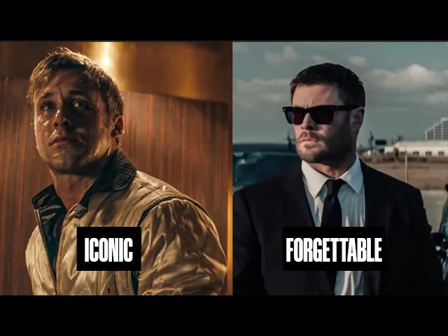
3:51 To figure out if this point actually worked,
3:52 I looked at two shots from two different movies.
3:55 One is this movie called Good Fortune with Keanu Reeves and Seth Rogen.
3:58 And then this other one is this 1970s indie that stars Jack Nicholson.
4:02 Both are like kind of diner restaurant scenes.
4:04 One's daytime, one's nighttime, so give credit to both of those.
4:07 There's something missing in the modern shot versus the old shot.
4:10 And we can look at this through different examples.
4:13 And I don't think this really has to do with color grade, digital, film.
4:17 And as a camera nerd, I don't want to hear this, but this is exactly the problem
4:20 that we live in, which has to do with tactility and status.
4:23 Both these shots look so beautiful,
4:25 but the difference between the two is stark because of the tactility
4:29 of one and the sort of flatness of the other.
4:32 Look at the materials that they're wearing.
4:33 You've got vibrant colors across the shot.
4:36 And not only just with what people are wearing,
4:38 but look at the actual seats that people are sitting in, the floor, the ceiling.
4:43 Everything has color and vibrancy.
4:45 Versus you compare that to a diner scene from a show now, it's gray and flat.
4:50 You don't actually have any color separation other
4:53 than what the DP's trying to pull out.
4:56 You could say this maybe lands on the production designer,
4:58 but production designers are only so good
5:00 as what spaces they're able to work in.
5:03 Now sometimes they can build spaces that look quite nice,
5:05 but other times if you're shooting on location,
5:07 you're kind of getting what you can.
5:09 To show you all I'll show you like a location scouting website.
5:12 Here in Canada, we have this thing called Set Scouter
5:15 and it's a like Airbnb for finding locations for movies.
5:18 And if you look at the locations available, there's a commonality between them.
5:22 A lot of them are gray, flat, metallicy with zero texture.
5:27 It's all just kind of the same wash of things.
5:31 And this is what I recognized when we were
5:32 shooting our new our most recent short film Destination,
5:36 which was we were shooting in some of the most
5:38 beautiful homes and spaces way beyond whatever I could afford.
5:42 And they looked good and felt good to stand
5:44 in as like a human looking for like a really nice space.
5:47 But when the camera actually found the frames,
5:49 it was really hard to make them look good because there was no color separation.
5:54 We were really trying to seek out like things
5:56 that had texture at least to make the characters pop.
5:59 But a lot of the stuff was very neutral toned, it was gray.
6:02 And then you partner that with actually how scenes how homes are lit now,
6:07 which is not candles or Edison bulb light bulbs.
6:11 It's all LED white pot lights that just don't look good.
6:16 And yes, your DP could just light it not with that kind of lighting,
6:20 but when you're trying to seek out practical
6:22 lighting within a space to make it believable,
6:25 it's really difficult to take something that is already in the space and pretend
6:30 that it doesn't exist and rather production
6:33 design things like lamps inside the space.
6:35 This is like a technique you can use, but it's not always the most applicable.
6:39 Back in the day, if there was a chandelier in the shot, the DP would like,
6:42 let's use that as our source light and make the scene work around that.
6:46 Now we have pot lights and LEDs.
6:48 There was a cool thing I saw about the movie Drive,
6:50 which is it was the last movie that was
6:52 shot in LA that used the sodium vapor lights, like the yellow looking lights.
6:57 That's why it has such a look.
6:58 You compare movie Drive to a movie like Crime 101,
7:02 which I think is beautifully shot.
7:04 They both have a different look.
7:06 There's something different between the yellow
7:08 and orange tone to now this digital cleanness.
7:14 And it doesn't always have to do with cameras and film and studio interference.
7:18 It has to do with the era we live in.
7:20 I saw this really cool diagram of the color spectrums that we used to live in.
7:24 I think it was like from the 1800s onwards into now the 2000s.
7:29 And if you look at it,
7:30 it's actually really depressing the direction it goes into.
7:33 So it starts like very vibrant like a rainbow and then
7:36 eventually it just funnels down into being like gray, flat, muddy tones.
7:43 And that influences how we think and feel.
7:46 Even cities like don't allow you to paint your color your house
7:50 a certain color so that it sticks within a certain tone.
7:53 And this doesn't just influence the setting of where we shoot our movies,
7:57 it influences how we artistically represent ourselves in our work.
8:01 If we're just exposed to gray and flat,
8:04 I think that trickles down into the work that we're creating.
8:07 Even movies that should be vibrant and have
8:09 a ton of color and contrast still come out flat.
8:13 And going back to movies that were shot in the 70s,
8:15 there was so much texture and detail not
8:17 only within the people's faces and the setting, but also within the materials.
8:22 You get to work with a crew, you get to collaborate with production designers.
8:26 And they're the like secret sauce to making shots look beautiful.
8:30 If you're working on a budget and you're setting your film in this era,
8:34 you're limiting yourself to the materials that we have,
8:36 which is a lot of plastics, synthetic materials,
8:39 and stuff that just doesn't look good on camera.
8:42 The stuff that read well in the golden age of cinema
8:44 was stuff that actually had a certain like material to it.
8:49 It's like wood grain and cotton.
8:51 It was natural materials.
8:53 So while I do think the conspiracy
8:54 of Netflix trying to build attention hooking content using
8:58 all the tricks in the book to keep you engaged the same way Tik Tok is true,
9:03 I also think we live in a very uninspiring era.
9:07 And for me as a filmmaker, I never want to set movies that are based
9:10 in 2026 because nothing really looks as good as let's
9:13 say something that was based in the 1700s where
9:16 wallpaper filled the wall or there's wood grain texture.
9:19 Light was motivated from candles and lamps.
9:23 This era just sort of feels too optimized and synthetic and less tactile.
9:28 When I was talking about movies being set in different eras,
9:30 I looked at Steven Spielberg as a good example piece.
9:32 He's someone who has shot movies in [music] the past,
9:35 also shooting movies set in the future and current time.
9:39 And what I recognize with his stuff is he's still using
9:42 things with tactility even though based in eras that are less tactile.
9:47 For example, the new trailer for Disclosure Disclosure Day is set,
9:52 I believe, in 2026 least now-ish.
9:55 And if you look at the locations they're shooting in, there's wallpaper,
9:57 there's like metallic metals, things with reflective surfaces.
10:02 Even if it is in someone's modern day home,
10:04 there's kids drawings in the background, there's lamps and dim lighting.
10:09 So, even if it's in sort of moderate-esque spaces,
10:12 he's wearing them down or adding texture into the space,
10:16 making them feel like they're still set
10:18 in like the '90s even though it's current.
10:20 Like, look at this couch.
10:21 This couch is not from 2026 whatsoever.
10:25 It's definitely like something from probably ET, but yet it works.
10:30 And it's because it looks good and tells more story
10:32 than half the you can buy in IKEA right now.
10:35 Why would they do this?
10:38 So, if you're ever watching a movie and you think, "Oh,
10:40 what's Why does this not feel good?" Or perhaps you're shooting something,
10:43 take a look at what's within the frame and less about what's shooting the frame.
10:48 And yes, it could be studios trying to keep people's attention
10:51 span hooked by making the image just flat so you just like,
10:54 I don't know, are drawn into it more.
10:56 But I would argue that the production
10:58 designer and cinematographer did a good job.
11:00 I think it actually has more to do with the space
11:03 and sort of tones that we're working with in now.
11:06 Now, this is all just from personal experience.
11:08 I want to know what you guys think.
11:09 Let me know in the comment section below.
11:11 I could be just some crazy guy or maybe there's a point.
11:14 But this is all just from personal opinion.
11:16 As you can tell, I have to pee.
11:18 So, I'm going to go.
11:20 I love you guys.
11:20 I'll see you in another video.